Movie posters are awesome, especially horror and sci-fi ones. If they’re really good, one could stare at them for hours. There’s also been an evolution in what and how they convey the content of the films they promote. Without going into an exorbitant amount of detail, pre-1970s posters were gloriously cluttered with huge comic book-style typography and featuring the hero in peril with an obtuse hint of the villain; in the 1980s we got a slightly different typography and very artistically painted posters (even if what they showcased was gruesome) and some play with 3-D; and in the 1990s things went to shit. In the wake of the Internet, though it’s taken some time, we still have stock still being used in wall posters, but at least we’re getting interactive/animated posters, a form that holds a lot of potential.
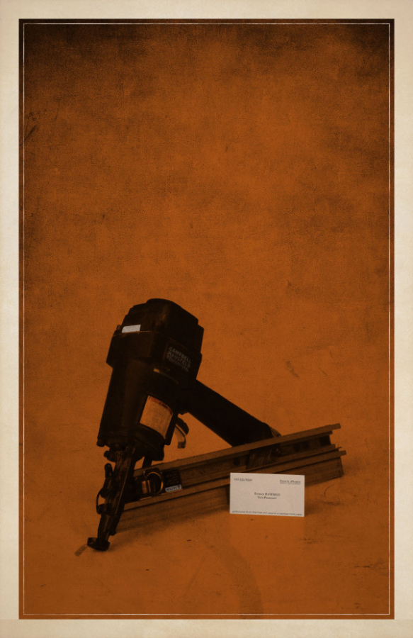
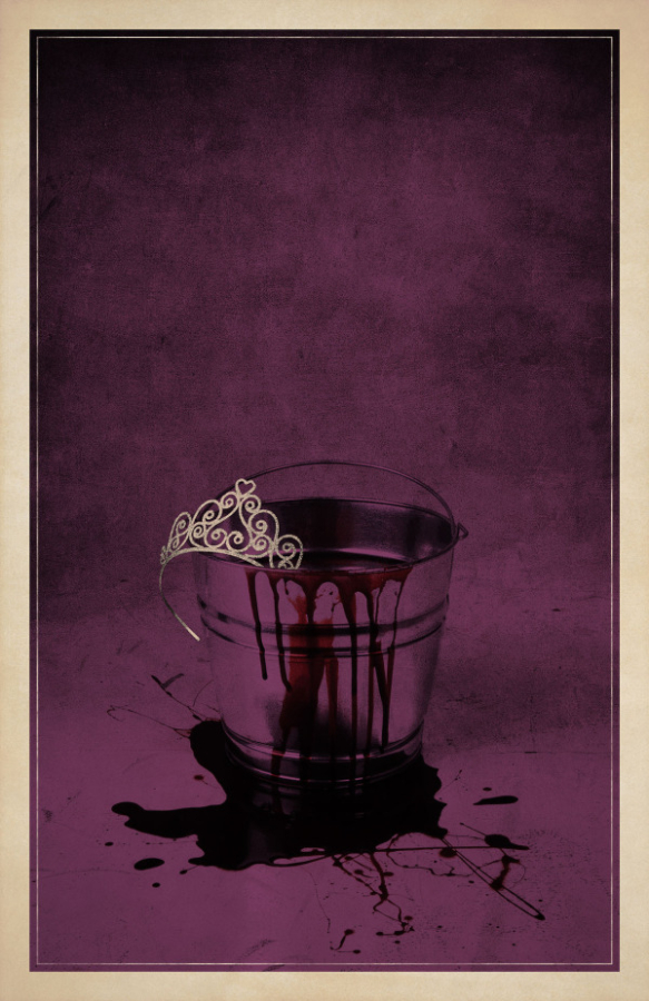
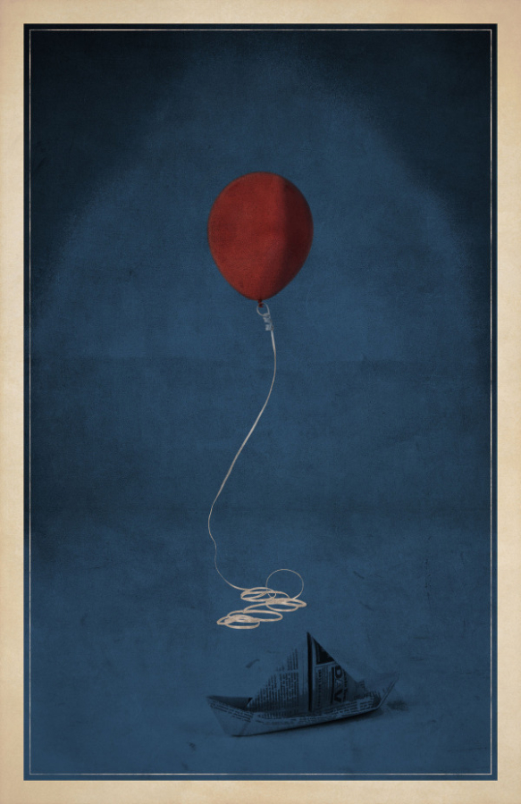
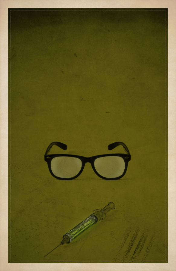
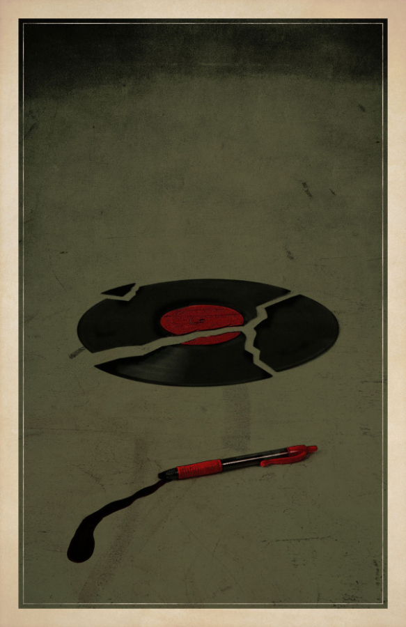
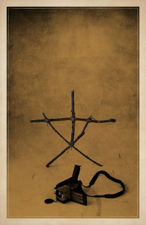
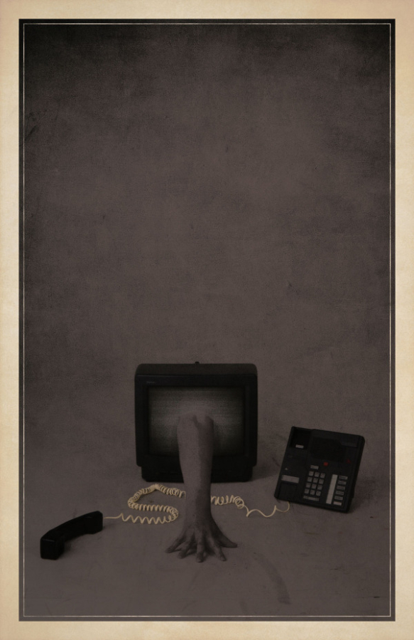
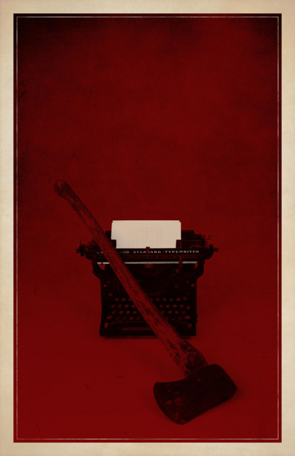
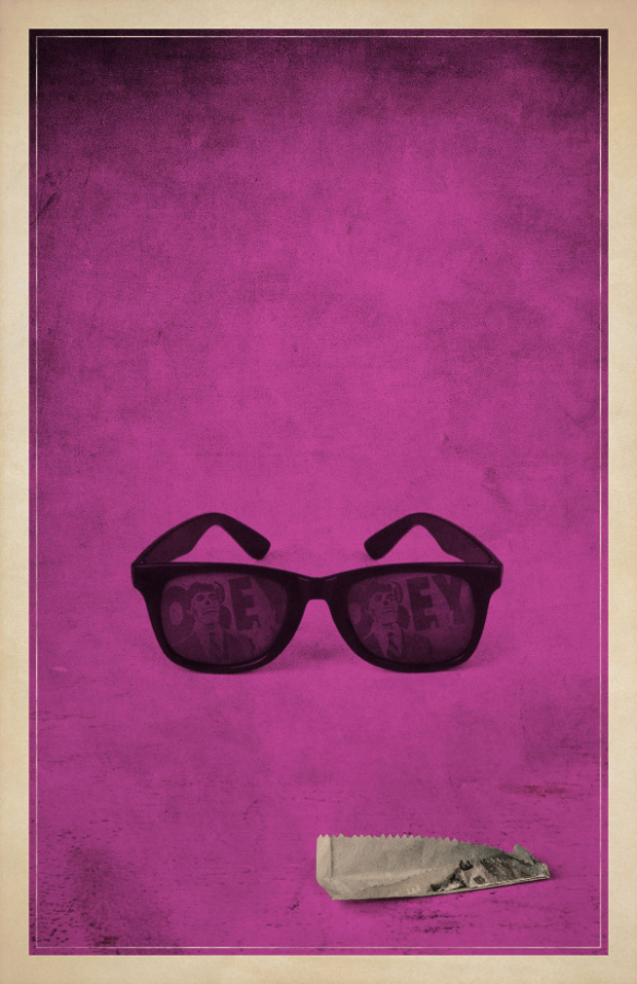
Today, however, we’re giving you a totally different approach to horror movie posters — a minimalist one. In the gallery above, have a look at the series of minimalist horror movie posters and spot the ones you know. Let us know how many you got in the comments section below. Personally, they look pretty damn awesome. I wish I could tell you whom the artist is, but sadly my source didn’t provide a name (if you know who did these, please let us know).
Rock Hard \m/




Stay Connected